7 Interior Paint Color Trends in 2025 – Design Ideas for a Modern Home
-
Codee Chessher
- Last updated:
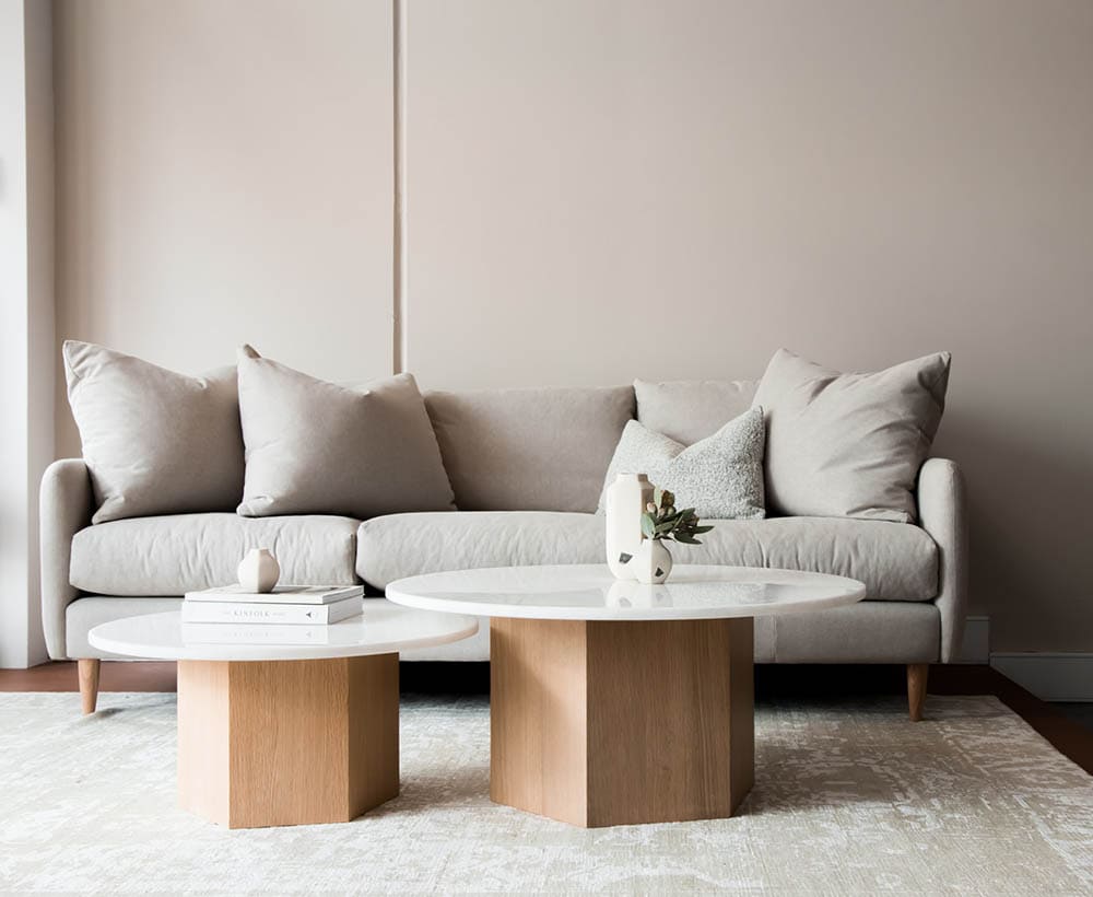
After the past few chaotic years of living through a pandemic, a lot of people are looking to change up their living spaces with new colors. There’s something distinctly magical about painting your house a variety of inspiring shades that can transform your entire living experience. Let’s take a look at some of the hottest new interior paint color trends this year.
The Top 7 Interior Paint Color Trends in 2025
1. Terracotta
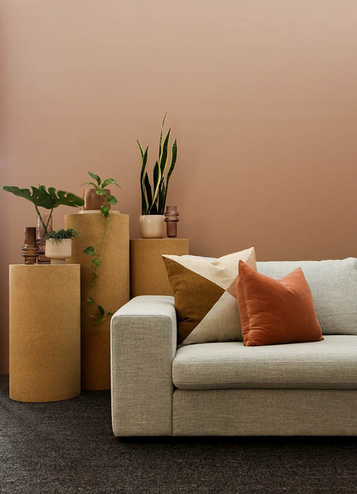
Terracotta is a beautiful color that’s been neglected for far too long. Reminiscent of the Southwestern US desert and Venetian architecture, terracotta provides a calm, earthy tone to any living space. Many people feel it helps make a space feel more grounded, which is especially important after these last couple of years.
What’s interesting about terracotta is that it can work for any type of room. A large living room with a darker burnt sienna-type terracotta and olive-green accents makes the whole room feel more elegant, especially if you go all-out and get matching furniture.
Some of the best colors to pair with terracotta are olive green for a luxurious Italian look, or even tans or beiges to take a room into a more neutral space. However, lots of colors play well with terracotta. You can use rich blues to play off the red undertones and brighten the room and warm white or gray will help give a sober, classy look.
2. White
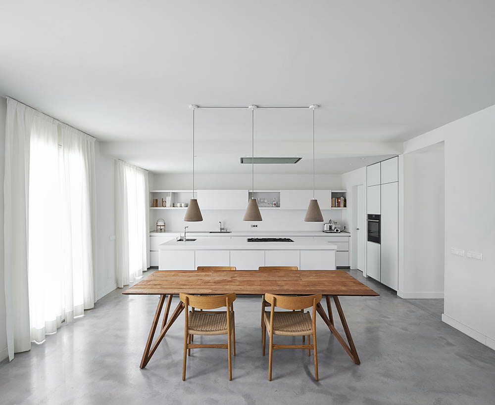
White is the most timeless color and continues to be popular this year. Bright whites are often used in rooms with lots of natural light to make the room seem larger or more open than it really is. Warmer, muted shades like eggshell make rooms feel warmly elegant, unlike crisp whites that can get too sterile and impersonal.
White works great with anything, which is a huge reason it’s persisted all these years. White makes a great background for spaces with lots of bright colors because it balances out what would otherwise be color overload. In this way, it’s something of a palate cleanser for the eyes. White as the background with a colorful foreground works great by itself, or you can add some black to further enhance the look.
That’s just one of the various ways you can use white. Another interesting way of using white is to layer many different shades of white. Make the walls a crisp white, then decorate with warm whites to add dimension. This type of color scheme is popular in Scandinavian designs, but it’s been catching on in the US lately.
When choosing a shade of white, think about what you want it to achieve in your space. To serve as a background, crisp whites are good because they don’t feel sterile in spaces with lots of colors. As the primary color for a room, though, a warmer white would be better.
3. Green
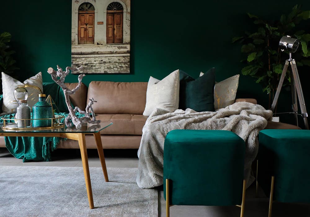
Green is exploding in popularity because it evokes nature, growth, and optimism. Green is very versatile because it ranges from bright seafoam and brilliant emerald shades all the way to more muted tones like olive and sage. Using the bright greens with the understated greens can be a wonderful way to create a space that feels alive, especially if you have some greenery in the house as well.
Blue is an awesome color to pair with green, especially if you’re going for a naturalistic theme. Muted seafoam with cerulean, for example, is a gorgeous color combination suggestive of the sea. Gray is a more grounded color to go with green and lends a space a sense of quiet sophistication.
Finally, deeper green and white is a clean, classic look for any room, particularly kitchens and bedrooms. Stay away from lighter greens when using white, as a lighter shade of green would compete with the white for attention. Darker greens are ideal to provide much-needed contrast.
4. Brown
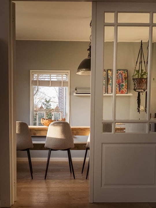
Brown gets a bad rap because when used poorly, it makes a room feel muddy or even forbidding if you use too dark a shade. Brown is actually a very warm neutral color that pairs well with a number of colors. Used well, it can give your home just the touch of traditional charm you need.
White is, as always, a great complementary color for brown. The light and dark feeling is very clean and appealing to the eye. A less conventional color to go with brown is yellow, which livens up the grave atmosphere brown can sometimes emanate. For a darker Baroque style, make that gold with a rich mahogany shade.
Lastly, orange and brown are a very warm and cozy color duo embraced by the hipster subculture. Chocolate brown walls with bright orange furniture, for instance, adds a lot of charm to a space.
5. Pastels
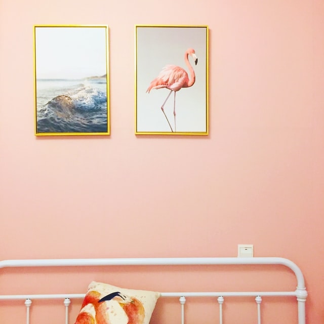
While they fell out of favor for some time, pastels are making a big comeback. With their light whimsical hues, pastel colors are evocative of old-timey milkshake bars. They help any room radiate an inviting and almost delicate energy, and there are enough different types of pastels that you can find any combination to delight your eyes.
Sage is easily the most earthy, naturalistic hue out there, and one commonly used with white to produce a tranquil den-like atmosphere. Trade white for pastel pink to achieve a more classic, uplifting effect, or a pastel blue for an airy feel.
Lavender and blue are some of the prettiest pastels, mimicking the sky’s natural color and trapping it in your living spaces. These colors look beautiful in a room with hardwood flooring, which will ground the room and tie it together.
6. Violet
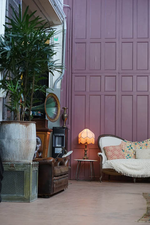
Once the color of royalty, violet continues to add a refined and regal sensibility in our homes’ interior spaces. Soft shades like lavender can add a romantic air, while brighter amethyst tones are cheery. What makes violet so versatile is that it’s a mixture of blue and red, arguably the two most important colors on the palette wheel.
Try using amethyst with black for a very contemporary, almost exotic coziness. If you want to lean into purple’s regality, use royal blue as a complementary color and yellow accents for starbursts of brightness.
As purple’s diametric opposite on the color wheel, yellow is likely the most well-known complementary color. Deep violets benefit greatly from light yellows that balance the room and help give your eyes a break.
7. Black
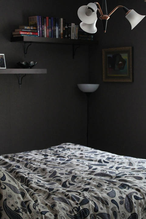
Black is sometimes called the ultimate neutral color because like white, it goes with everything. Unlike white, black adds edginess and sophistication when used with other colors. Also worth noting is that black will make rooms feel more enclosed, which can be oppressive if not balanced properly.
You could paint all the walls black, but then you would have to avoid black furniture in an effort to balance its light-sucking properties. Personally, we’d advise using black in conjunction with another major color, like white, but all colors match with black! Mix and match your colors to find what works best for your space.
For living rooms, we’d advise using black as a secondary color to add dimension and visual appeal, with another major color as the primary focus.
 What Color Is Right For Me?
There’s no single ‘best’ color for every situation or even every room, although some are more versatile than others. Let’s take a look at some ideas to help you choose what colors are right for your interior spaces.
- Match your furniture: This is one of the easiest ways to revamp a room without breaking the bank because you just have to look at what furniture you have and decide what colors would play well with it. Loads of white, black, or brown always benefit from a classy white, while other individual colors vary. Take a look at a color wheel for some inspiration.
- Pick a color to establish a mood: Green, for instance, evokes nature, and many blue colors are designed to be tranquil. White helps open a room up and balance other colors or is used as a base to create a timeless or contemporary feel.
- Use contrast: Opposing colors on the color wheel generally play well together in homes. Red and blue are well-known examples, but others include yellow and purple as well as orange and deep blue.
Featured Image Credit: Nathan Oakley, Unsplash
Contents
