
Have you ever walked into a clean white room with minimal furnishings and decorations? The bare room probably seemed to engulf you, which can have a relaxing, orderly effect on some individuals while overwhelming others. If you repainted the same room in a darker color, however, the same space might appear smaller, even though the dimensions haven’t changed.
Color psychology impacts our brain by influencing the way we feel about a space, and even our logical processing to a limited extent, such as believing the room has shrunk. Its effects aren’t limited to the room itself either. For example, red and orange colors may make you feel hungry or intensely passionate. Interior designers utilize color psychology to their advantage by invoking feelings about space through color. As a DIYer, it’s interesting to know the different ways colors can set the mood when choosing materials for your next project.

What Is Color Psychology?
While there is loads of anecdotal evidence about the way colors make us feel, most of the claims aren’t scientifically proven. Some researchers suggest this is because colors do influence the way we feel, but our cultural upbringings direct how these effects are felt. For example, if you go to a gender reveal party today, pink may be the color shown if the baby is a girl, and blue may be displayed if it’s a boy. However, through the beginning of the 20th century, it was the opposite! Thus, our associations with blue and pink are deeper than the colors themselves, which simply evoke an inference based on experience.
However, interior designers are fairly united about how they use colors nowadays. Thus, their art cultivates a widespread association for the way colors convey emotions.
The 11 Tips on How to Use Color Psychology in Interior Design
Here are some common colors used in interior design, as well as where, why, and how to use them.
1. Purple
- Ideal for: Bedroom or anywhere you want to make a statement
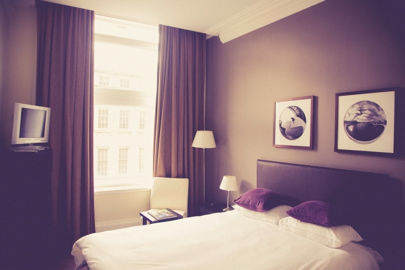
During the Renaissance, it was illegal to wear purple in England unless you were royalty. Nowadays, you can include purple in your everyday décor while still feeling fancy. Lavender evokes a calm yet playful mood that is best reserved for an elegant parlor setting, while bold purple gives the room a pop of color that is perfect for areas where you want to show off. Decorating a house with purple shows that you’re confident in your choices and comfortable with who you are, royalty or not.
- Bold color makes a statement without being too flashy
- Associated with royalty
- Can become overwhelming
2. Pink
- Ideal for: Bedroom, hangout spaces
Pink acts like a ping pong ball bouncing back and forth across history, from being a hallmark boy’s color in the early 20th century to being associated with femininity by the mid-1900s. Pink is still associated with females today, but slightly muted variations such as mauve are popular in design trends for any room. Generally, tender pinks are associated with baby girls, while bright magenta pinks are top picks for teens. Emotionally, pink is a happy color, but bright shades may seem overwhelming if used excessively, especially in a small space. Try adding pops of pink intermixed with a more neutral color like white or black to give the eyes a break.
- Modern association with femininity
- Mauve is making a comeback as a gender-neutral design choice
- Bright shades of pink can overwhelm a small space
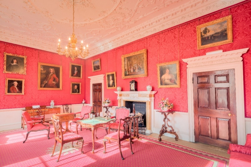
3. Red
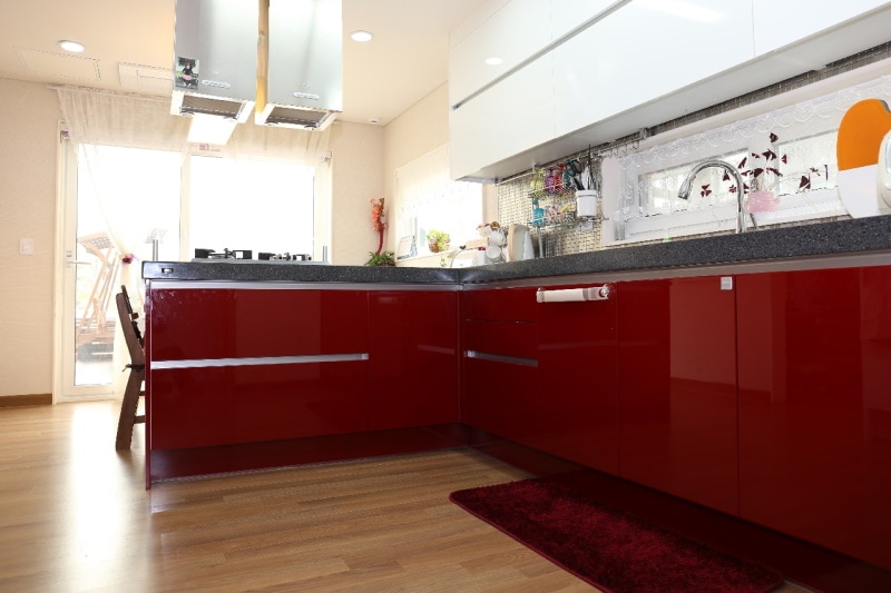
- Ideal for: Kitchen, dining room, conversation areas
Red evokes feelings of romance and rage, love and war. The only thing red can never claim to be is neutral. Studies have shown that red can actually make you feel hungry, so we suggest using it around the kitchen or dining area. Since it isn’t a calming color, red probably isn’t the best choice for a living room or bedroom, although some people like it in the bedroom because they believe it suggests passion.
- Associated with hunger and passion
- Lively color
- May be too bold for areas where you’ll be winding down
4. Orange
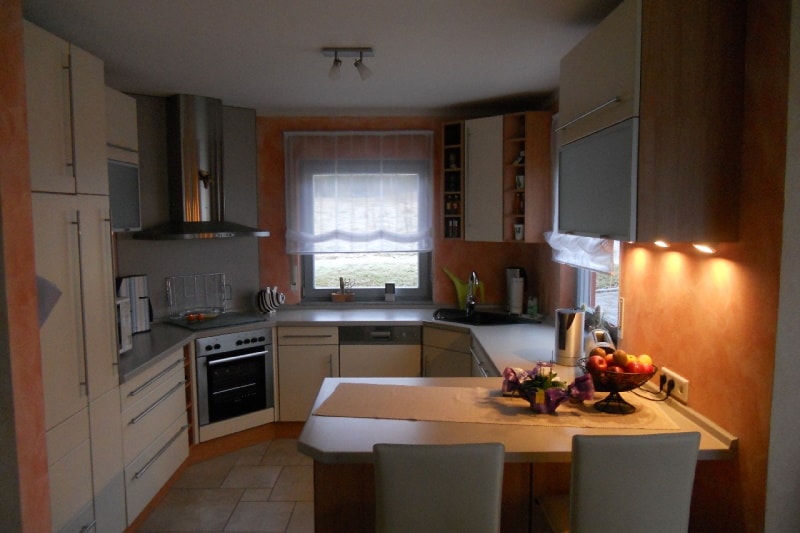
- Ideal for: Living areas, kitchens
Orange is red’s happy-go-lucky cousin that goes well in living spaces where you host engaging conversations. While it isn’t as aggressive as red, it still may have some of the same effects on your appetite, so it works well for the kitchen, too. As a bold and sunny color, orange isn’t our top pick for a bedroom. Orange works best as a warm hangout color where you can order a pizza and spend some time with friends.
- Warm and happy color
- Encourages hunger
- Too lively for a bedroom
5. Yellow
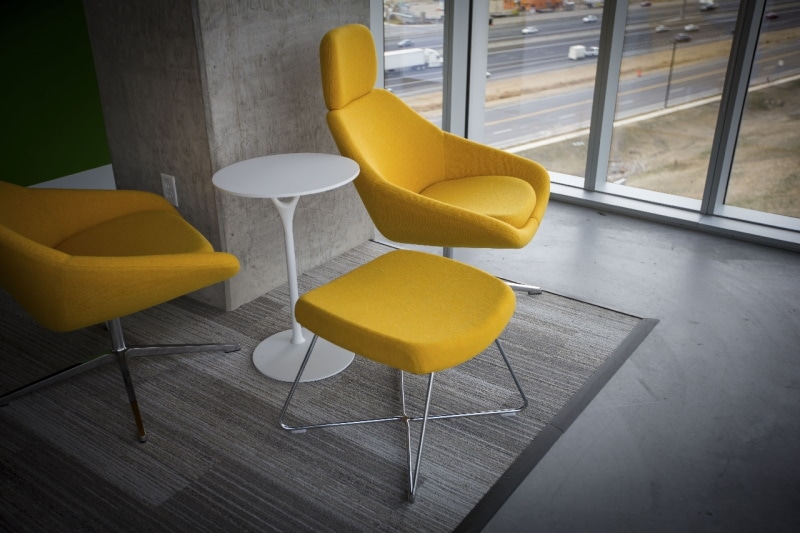
- Ideal for: Bedroom, kitchen, office, bathroom
All yellow colors brighten any room, but you’ll need to examine your intentions to find the most suitable shade. Pale yellow simultaneously wakes you up and relaxes you, sort of like your first cup of coffee in the morning. This shade works well for offices, bedrooms, and even kitchens. Brighter, more saturated hues go well in eating areas, especially in a lemon theme, and bold yellows can bring life to living spaces. Avoid painting a nursery yellow, however, since it’s been linked to a higher crying rate in infants.
- Light yellow is perky without being obnoxious
- Bright yellow livens a living space
- Avoid painting a nursery yellow
6. Blue
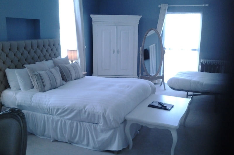
- Ideal for: Bedrooms, offices, bathrooms
We don’t think blue is ever a bad idea. However, it’s a calming and peaceful color that you might not want to bring down your party. Additionally, since blue is the opposite of red, it can actually quench your hunger, which may not be ideal for spaces where eating is encouraged. Bedrooms and bathrooms are the best places to use blue since you want those areas to feel relaxing. If you use blue in an office, you might consider shaking things up a little with a brighter color like orange or yellow to keep you motivated.
- Calm color goes well in bedrooms and bathrooms
- Decreases appetite
7. Green
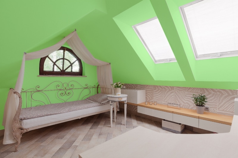
- Ideal for: Practically anywhere except bathrooms
You might have heard it’s not easy being green, but it’s actually the most natural color on earth. We think certain shades of green can work for any space. Cool hues relax the body while pungent lime shades can add some flair. One thing you should keep in mind about green is that certain shades may make you look sickly, so you might want to avoid using it in a bathroom or places with a prominent mirror.
- Versatile color
- Soft hues relax while bold hues add attitude
8. White
- Ideal for: Offices, bedrooms, bathrooms
Per the current minimalist trend, a predominately white room feels organized and tidy. Depending on how you style the rest of the room, the shade has the opportunity to evoke feelings of completeness, boredom, or sheer panic. White works best with either one or two simple colors mixed in the décor. If you prefer a more modern aesthetic, try complementing white with contrasting neutral hues, such as brown or black, especially if the furnishings have texture such as wicker. If you want the room to feel cozy while still having a clean appearance, try adding a gentle pastel color. Avoid choosing all white furniture and accessories with white flooring, ceiling, and walls, or you might feel like you’re living in an asylum instead of a sanctuary.
- Feels relaxed and tidy
- Gives you the freedom to decorate with other colors
- Gets dirty easily
- Too much white can feel uncomfortable
9. Brown
- Ideal for: Offices, living rooms
Brown never goes completely out of style since it’s a neutral color with different hues. However, brown walls can significantly darken the room and leave a somber effect, so the color works best as an accent instead of the primary color.
- Can be used almost anywhere, but preferably as an accent
- Too much brown can have a depressing effect
10. Gray
- Ideal for: Anywhere
Gray is a very versatile color that’s taken modern design trends by storm. In the mid-2010s, it replaced beige as the neutral color of choice, and is often paired with black, white, or dark blue. Some people might argue that gray feels depressing, like a rainy day, but others think it makes the room more sophisticated. Your perception of gray depends more on your personality and tastes than traditional color associations.
- Modern neutral color that may be used anywhere
- Evokes feelings of sophistication and strength
- Gray may have a depressing effect on some individuals
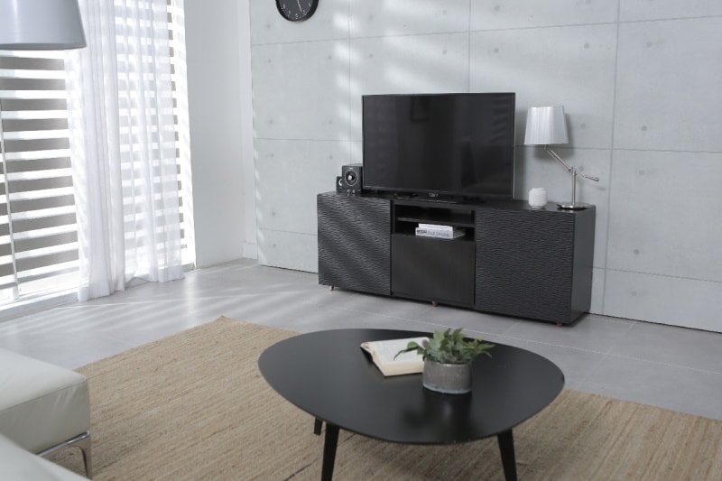
11. Black
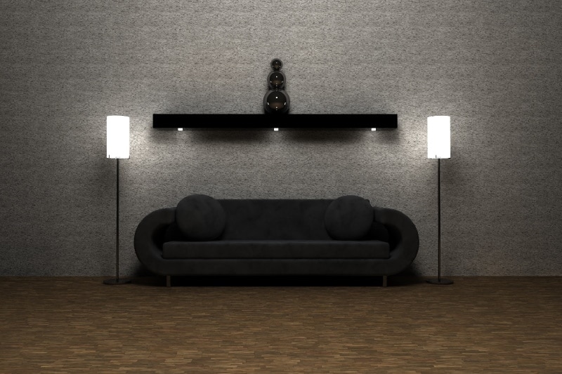
- Ideal for: Furniture and accents
Like an outline on a picture, black can embolden your room and give the other colors contrast. As the densest color on the planet, black would easily overtake a room if all of the walls were painted black. Black works best as an accent complementing white, gray, or bold colors. It can be used in any room and has a decidedly modern but timeless style.
- Perfect accent color
- Works well in any room of the house
- Probably too bold to be the only color in the room
How to Use Colors
Once you know how all of the different feelings that colors suggest, you can pair them with each other to project the image you desire. Want a space that feels both happy and peaceful? An exciting orange or pink plus a calming green or blue color might do the trick. Researching past trends can also help you decide on your own ideal aesthetic, whether that’s a mid-century modern green and orange mix, or a 1980s blue and pink cottage combo. You might even switch things up a little by taking patterns from one era and mixing them with colors from another to tell your own story.
Conclusion
It is a truth universally acknowledged that colors are associated with our emotions. However, these exact associations often differ slightly by cultural and personal experience. When you’re planning designs for your own house, you might want to give a nod to historical meanings while putting your own spin on it. For example, purple is a royal color while gray lends an air of sophistication. You might want to paint your own modern castle gray with purple accents. The good news is that it’s the 21st century, so you don’t actually have to be royalty to decorate with purple. If you have a positive association with the color, then include it in your home regardless of the psychological connotations.
Featured Image Credit: Leah Kelley, Pexels
Contents
